Brand Refresh for a Famous Sauce Maker.
David Tran founded Huy Fong Foods (HFF) after fleeing Vietnam in 1979. The brand’s name comes from the freighter that carried him to the U.S., and the rooster represents his birth year in the Vietnamese zodiac. HFF grew rapidly, moving to larger facilities over the years.
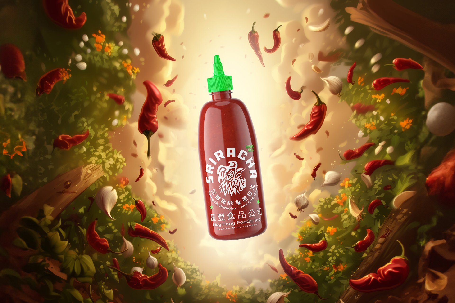
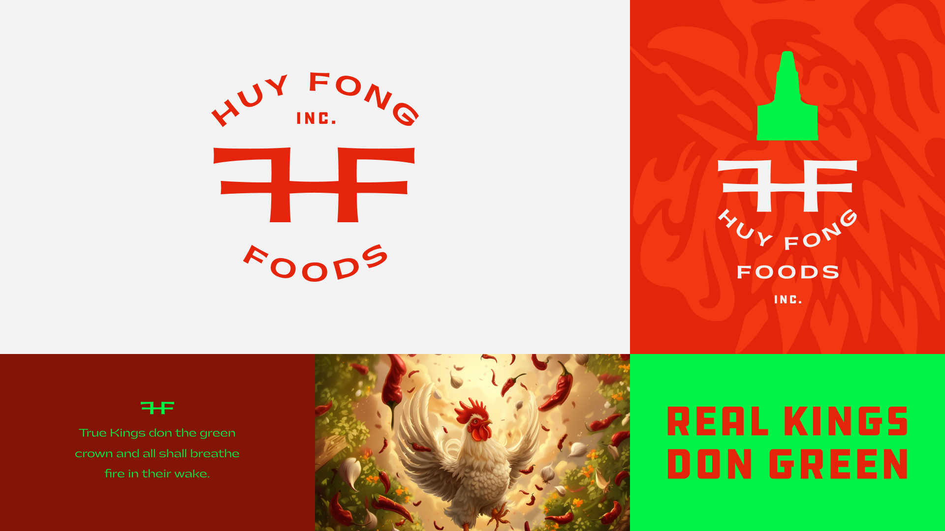
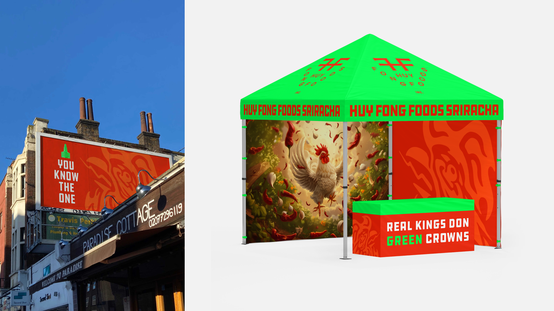
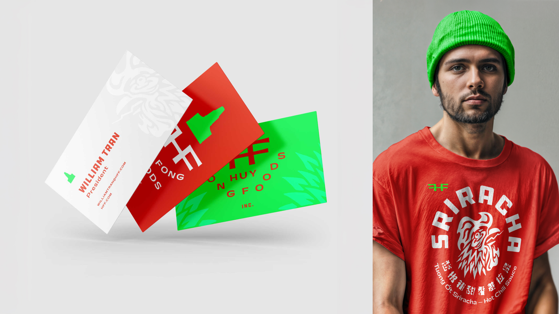
The iconic red bottle with a green cap resembles a chili stem. In my refresh, the red is brighter, the green more vibrant, and the rooster more dynamic. The new logo features bold monogram and Gatwick font pairings for a clean, striking look, with marketing focused on the green cap as the crown of sauce royalty.


